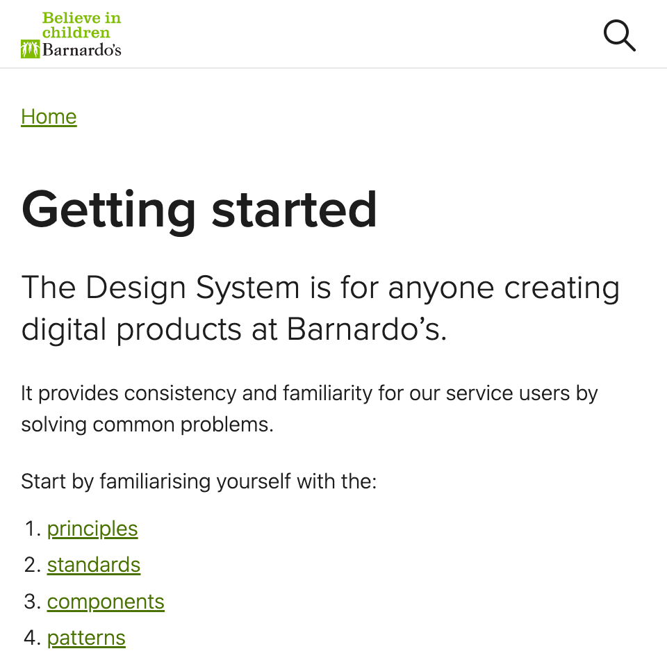
Richard Hallows

UX Developer

Highlighted projects

Screenshot of a Stylelint documentation page

Created a linter to help tens of thousands write modern CSS

I created Stylelint, an open-source CSS linter. It has over 100 built-in rules to help enforce error-free and modern code.

It's downloaded 18 million times a month and used worldwide in companies like Google and GitHub.

Screenshot of the home page of The Standard website

Improved the experience of London's most-read newspaper

I consulted on the design system for The Standard. It uses fluid typography to create an optimal reading experience for 1.4 million daily users.

I brought about effective collaboration and cost savings by bridging the gap between design and development.

Screenshot of the getting started page of the Barnardo's Design System

Built the design system for the UK's largest children's charity

I built the design system for Barnardo's. It contains principles, guidance and examples to create accessible digital products.

I extensively researched the ideal patterns and components for large content websites.

Screenshot of the homepage of Thrift+

Doubled the conversion rate of Thrift+'s e-commerce platform

I co-created the design system for Thrift+, the UK's leading preloved clothing platform.

Through research into e-commerce best practices, the website redesign doubled the sales conversion rate.

About me

I create design systems for fast, easy-to-use and accessible websites. I'm a CSS expert, but I'm also as comfortable designing and prototyping flows in Figma as I am writing code.

I have an eye for detail from working at creative agencies on award-winning projects such as Inside Abbey Road for Google Creative Lab (Webby), GEOX Amphibiox (Cannes Cyber Lion), and The Kaiser Chiefs' The Future is Medieval (D&AD Yellow Pencil).

Let's talk

Whether you're kicking off a new project or needing a hand with an existing one, I can create a design system to help you deliver.

consultancy@richardhallows.com

The following is my digital garden. It outlines how I leverage the browser to write less code or nothing at all.

I mostly design in the browser for the fewest capabilities:

Then I responsibly enhance the design to minimise the impact on:

While acknowledging the lack of control I have on the web.

I put my work in front of users early and often by:

I practise inclusive design to meet permanent, temporary or situational needs, and I use established patterns that are familiar to users.

When designing in Figma, I use features that align with the web:

Writing content

To ensure everyone understands me, I:

I aim for a reading age of about 9. For technical and professional content, I aim for 12. I check the reading age of content using Hemingway.

Writing code

I respect that:

Building on the browser's default

I layer accessibility improvements onto the browser's default styles.

@layer defaults {
  /**
  * Improving the browser's default focus visible styles
  */
  :focus-visible {
    box-shadow: 0 0 0 1px white;
    outline: 2px solid black;
    outline-offset: 2px;
  }
}

Cascade and inheritance

I only override styles between cascade layers to minimise side effects.

I leverage the inheritance of properties and custom properties to encapsulate styling and provide flexibility.

@layer components {
  /**
  * The child component dictates a styling API
  * by declaring what is inherited.
  *
  * By setting padding-inline, we signal it's unchangeable.
  */
  child-component {
    background-color: var(--child-background-color, white);
    padding-inline: 1rem;
  }

  /**
  * The parent component can change the child component's
  * background and text color via inheritance as:
  *
  * - background-color is defined as a custom property
  * - color inherits by default when not defined
  */
  parent-component {
    --child-background-color: black;
    color: white;
  }
}

Fluid web design

I use comparison math functions to size space and elements relative to the viewport or container size.

example-component {
  /**
    * A font size that has a:
    * - minimum value of 1rem
    * - central value relative to the container's inline size
    * - maximum value of 2rem
    */
  font-size: clamp(1rem, 0.5rem + 0.57cqi, 2rem);

  /**
    * An inline padding size that's either relative to the
    * size of the characters within or the viewport's
    * inline size
    */
  padding-inline: max(50% - 28ch, 4vi);
}

Parents lay out children

I create components that look inwards so that their parent can lay them out.

I embrace the browser's default of Flow Layout then responsibly enhance with layout modules like Grid, Flex and Multicol.

/**
  * A parent component controls the position of
  * and spacing between child components.
  */
parent-component {
  display: grid;
  gap: 1rem;
  grid:
    "img . content" auto
    "nav nav nav" 2rem
    / max-content repeat(2, 1fr);
}

Additive properties

I avoid overriding properties within components.

example-component {
  /* These properties apply to all conditions. */
  color: red;
  container: example / inline-size;
  padding-block: 2rem;

  /* This property is added based on the selector. */
  &:not(:first-child) {
    margin-block-start: 1rem;
  }

  /**
    * The background-color property is added based on
    * non-overlapping container conditions.
    */
  @container example (width <= 20em) {
    background-color: blue;
  }

  @container example (20em < width <= 40em ) {
    background-color: yellow;
  }

  @container example (width > 40em ) {
    background-color: pink;
  }
}

Nesting pseudo-classes and at-rules

I nest pseudo-classes and at-rules, and use an explicit nesting selector for rules.

example-component {
  /**
  * Often combining nesting with the :is() pseudo-class
  */
  &:is(:hover, :focus-within) {
    color: orange;
  }

  @media (width >= 20em) {
    place-items: center;
  }
}

Ensuring consistency and quality

I use tools to ensure my code and designs are consistent.

I enforce specific units with Stylelint:

{
  "declaration-property-unit-allowed-list": {
    "/^font/": ["em", "vi", "cqi"],
    "letter-spacing": ["em"],
    "line-height": [],
  }
}

And consistent numeric design tokens with my stylelint-scales plugin:

{
  "scales/line-heights": [1, 1.25, 1.5]
}

I use GitHub Flow for workflow and version control, and GitHub Actions for continuous integration and delivery.

I adhere to Page Experience signals, including the Web Core Vitals.

I test with Lighthouse and: